[COM] Uno Apartments | 53m | 17lvls | Residential
[COM] Re: U/C: Uno Apartments | 16lvls | Residential
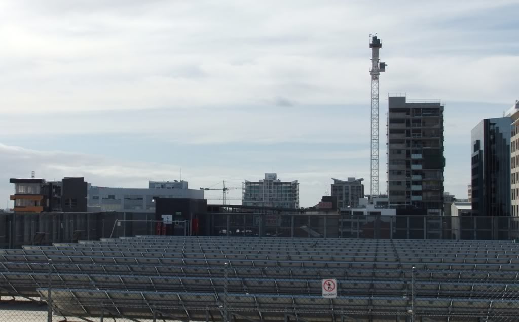
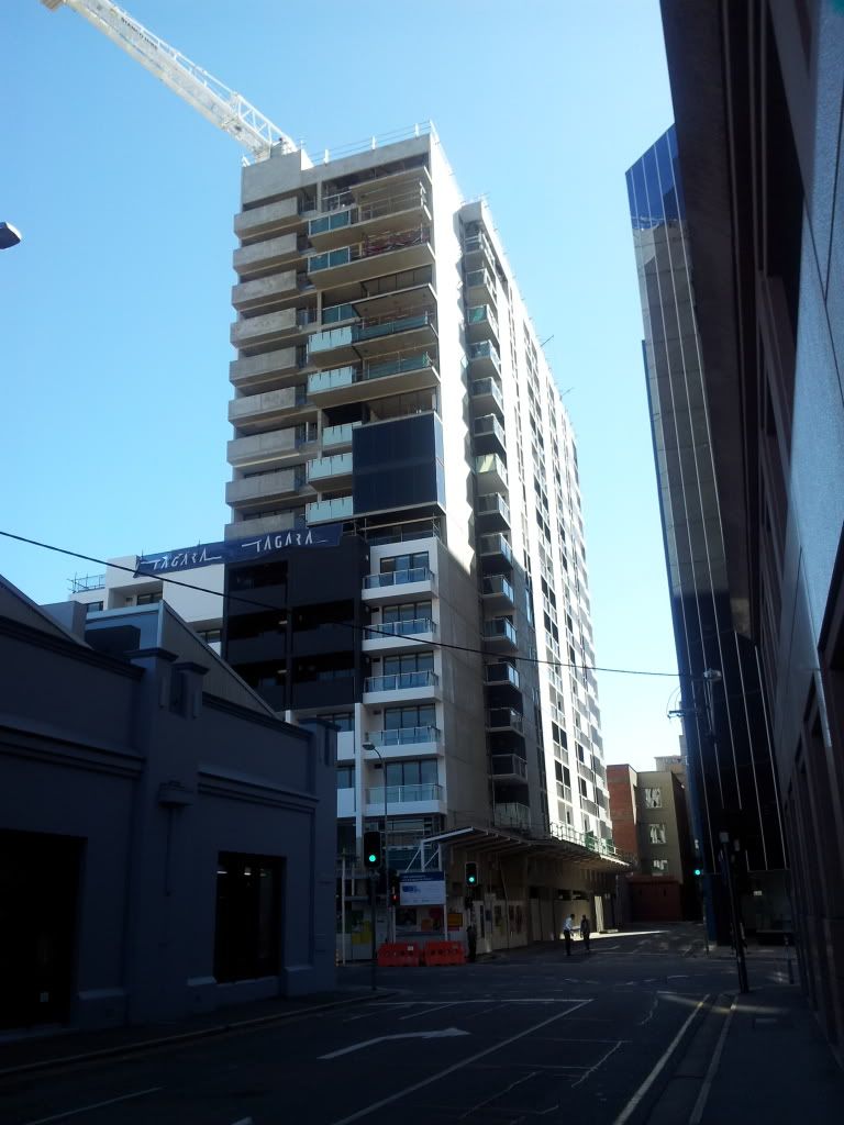
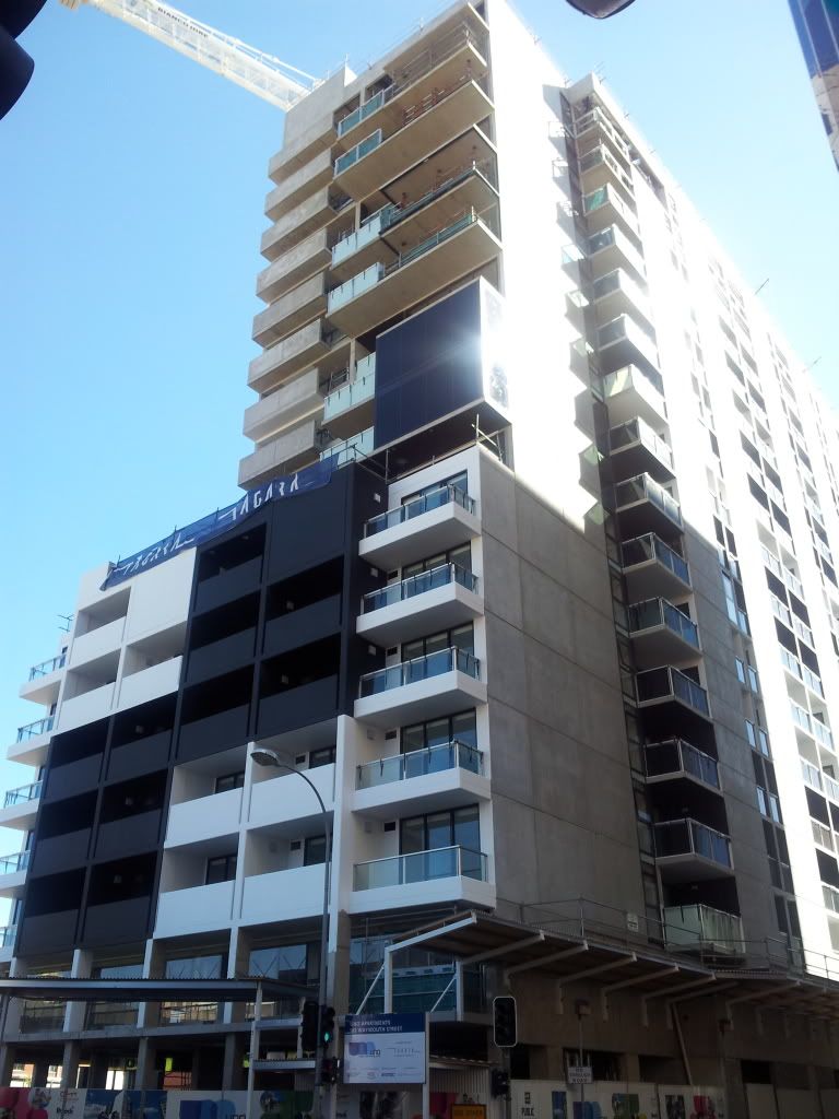
Whether or not it becomes a slum, well time will tell but one thing for certain is it already looks like one.
[COM] Re: U/C: Uno Apartments | 16lvls | Residential
...Which is why other proposals are being built to cover these up? dirrrr....crawf wrote:This looks so god damn ugly from the west. And to make things worse, this building combined with the blank walls of CC8 and Waymouth Exchange give the impression of one massive continuous ugly blank wall. It really is an eyesore.
[COM] Re: U/C: Uno Apartments | 16lvls | Residential
The only other proposal is the U/C Franklin St development which will block CC8 from certain angles with glass. Nothing has been proposed for Stage 2 of the UNO block nor anything that will block the Waymouth Exchange from certain angles. Eg western Currie, Waymouth, Franklin Streets.zills_86 wrote:...Which is why other proposals are being built to cover these up? dirrrr....crawf wrote:This looks so god damn ugly from the west. And to make things worse, this building combined with the blank walls of CC8 and Waymouth Exchange give the impression of one massive continuous ugly blank wall. It really is an eyesore.
Even if the Exchange was given a lick of paint or something, it wouldn't look so depressing and ugly in our skyline.
- Plasmatron
- High Rise Poster!
- Posts: 400
- Joined: Sun Sep 09, 2007 5:16 pm
- Location: St Georges, Adelaide, SA
- Contact:
[COM] Re: U/C: Uno Apartments | 16lvls | Residential
I'm surprised the building wasn't painted red, yellow, green and blue.


https://www.youtube.com/UltraVibeProductions
[COM] Re: U/C: Uno Apartments | 16lvls | Residential
Yeah the building is cheap and nasty but there was never going to be huge amounts of money invested in the design given homeless and low income will reside . Thats purely based on return of investment . The idea of homeless and low income residency is bloody brilliant , we all have our story all the best to them. As far as all these 'blank' walls I'm sure it would of been raised before but it's in the building code for 'fire restrictions' that windows can't be installed on an boundary to another allotment. Maybe if building going up down the road on light square corner was given approval to its original height of 13 stories from memory? we would have a glass frontage blocking that 'Uno' wall from the west
[COM] Re: U/C: Uno Apartments | 16lvls | Residential
It's all a bit second hand, but was having a beer with a mate as we gazed at this rather odd looking building, and he tells me the less-well off residencies will be in the rear section of the building and effectively seggregated from the front section of the building. His source is an architect connected with the development.
Regarding the unflattering view from the west, I'm hoping the soon-to-start apartments on Morphett St will go some way to cover it from certain angles.
Regarding the unflattering view from the west, I'm hoping the soon-to-start apartments on Morphett St will go some way to cover it from certain angles.
[COM] Re: U/C: Uno Apartments | 16lvls | Residential
North Korea anyone?. Though it will look better once the paint goes on..... I hope
[COM] Re: U/C: Uno Apartments | 16lvls | Residential
Is it too late to at least repaint the black sections white and take out the concrete barriers for the balconies and replace them with glass ones?
Any views and opinions expressed are of my own, and do not reflect the views or opinions of any organisation of which I have an affiliation with.
[COM] Re: U/C: Uno Apartments | 16lvls | Residential
unfortunately it is as ugly IRL as it is via photo.
- skyliner
- Super Size Scraper Poster!
- Posts: 2359
- Joined: Tue Oct 24, 2006 9:16 pm
- Location: fassifern (near Brisbane)
[COM] Re: U/C: Uno Apartments | 16lvls | Residential
Can't say I ever thought this was any good aesthetically. Like so many have expressed in some way, not up to scratch in many ways. A strange looking design.Has an unfinished, very blocky look.
ADELAIDE - TOWARDS A GREATER CITY SKYLINE
ADELAIDE - TOWARDS A GREATER CITY SKYLINE
Jack.
[COM] Re: U/C: Uno Apartments | 16lvls | Residential
Considering that the upper portion of the western facade is set back from the property boundary, I think it is extremely poor that it is a blank concrete wall. Furthermore, I will always wonder what posessed the architects to decide that concrete balustrades would look nice.
Who is online
Users browsing this forum: No registered users and 2 guests


