Ad blocker detected: Our website is made possible by displaying online advertisements to our visitors. Please consider supporting us by disabling your ad blocker on our website.
All high-rise, low-rise and street developments in the Adelaide and North Adelaide areas.
-
Nathan
- Super Size Scraper Poster!
- Posts: 3827
- Joined: Tue Feb 03, 2009 1:09 pm
- Location: Bowden
-
Contact:
#151
Post
by Nathan » Fri Jul 06, 2012 9:57 am
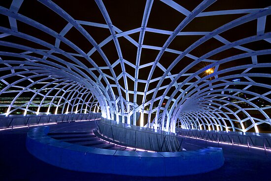
crawf wrote:I was thinking something similar to the Webb Bridge in Melbourne.. But I do like the Kurilpa Bridge.

But after giving it more thought, I'm torn. A canopy could ruin that postcard shot of riverbank from the King William St Bridge.
I love the Webb bridge. But you're right, the brief was for the bridge have a low visual impact so that it doesn't dominate the view, and to that end, this is an appropriate solution.
One thing that I hope does get looked at further is the width of the path going underneath on the Northern side. It's quite thin, right on the waters edge, with no barriers, on a curve, and at the bottom of a downhill stretch. That's going to spell disaster for cyclists. The southern side path is very wide, so it's easy to keep well away from the edge.
-
rev
- SA MVP (Most Valued Poster 4000+)
- Posts: 6448
- Joined: Sat Nov 11, 2006 12:14 pm
#152
Post
by rev » Fri Jul 06, 2012 10:27 am
-
jk1237
- Donating Member

- Posts: 1756
- Joined: Wed Jan 17, 2007 11:22 pm
- Location: Adelaide
#153
Post
by jk1237 » Fri Jul 06, 2012 2:41 pm
rev wrote:Besides a foot bridge I think they need to do something about opening up the train station to the riverside and make it more accessible from that side.
Correct me if I'm wrong but the main exits are on North Tce?
slightly wrong. There is already an exit at the Festival theatre end of the station that will connect up with this bridge. Surprisingly, quite a few students use it to get to Adel Uni
-
crawf
- Donating Member

- Posts: 5521
- Joined: Thu Feb 16, 2006 7:49 pm
- Location: Adelaide
#154
Post
by crawf » Fri Jul 06, 2012 2:48 pm
Should this and riverbank projects (including the casino/ Festival Centre) be moved to it's own thread?, seperate from Adelaide Oval and Convention Centre threads.

jk1237 wrote:slightly wrong. There is already an exit at the Festival theatre end of the station that will connect up with this bridge. Surprisingly, quite a few students use it to get to Adel Uni
I've used it before, but it needs some work.
-
Nort
- Super Size Scraper Poster!
- Posts: 2300
- Joined: Tue Feb 09, 2010 2:08 pm
#155
Post
by Nort » Fri Jul 06, 2012 3:56 pm
I like the bridge, it's elegant but not too flashy. Keeping the views as open as possible around the riverbank is a good thing.
-
SRW
- Donating Member

- Posts: 3659
- Joined: Fri Jun 08, 2007 9:42 pm
- Location: Glenelg
#156
Post
by SRW » Fri Jul 06, 2012 6:17 pm
I'm not sure what I think of it yet. I think it strikes me as somewhat unbalanced, as though there needs to be some sort of structural height on the northern landing to weight the height and mass of forms to the south. I'll admit it's relatively inoffensive, but I wonder if that's enough for our postcard location. I'll wait until there's more to judge.
Keep Adelaide Weird
-
Matt
- Legendary Member!
- Posts: 1125
- Joined: Wed Feb 07, 2007 12:36 pm
- Location: London
#157
Post
by Matt » Fri Jul 06, 2012 9:03 pm
Sweeping arc ending with a viewing deck and waterfall - hardly your standard cookie cutter bridge...
-
pushbutton
- Legendary Member!
- Posts: 1451
- Joined: Fri Jan 12, 2007 8:01 pm
- Location: Adelaide
#158
Post
by pushbutton » Fri Jul 06, 2012 9:16 pm
It's just a bridge for heavens sake! I can't believe the amount of time it's taken them to make such simple decisions. This should have been built 20 years ago.
-
ml69
- Legendary Member!
- Posts: 1009
- Joined: Mon Jan 03, 2011 11:16 pm
- Location: Adelaide SA
#159
Post
by ml69 » Fri Jul 06, 2012 9:51 pm
SRW wrote:I'm not sure what I think of it yet. I think it strikes me as somewhat unbalanced, as though there needs to be some sort of structural height on the northern landing to weight the height and mass of forms to the south. I'll admit it's relatively inoffensive, but I wonder if that's enough for our postcard location. I'll wait until there's more to judge.
I think you've nailed it, the design needs some kind of structural height so that the design itself becomes iconic.
It doesn't have to be anything too fancy, but it just needs something more in it's design to make it instantly recognisable, especially in Adelaide's most photographed location. Some form of structural height could also look fabulous at night lit up with LED lighting.
Apart from that, I love the concept. The curved plan is practical and elegant. I also really like the urban/landscape design at the Festival Centre end, and the waterfall/viewing deck at the Adelaide Oval end.
-
mutt
- High Rise Poster!
- Posts: 148
- Joined: Tue Apr 17, 2012 7:46 pm
#160
Post
by mutt » Sat Jul 07, 2012 12:43 am
ml69 wrote:SRW wrote:I'm not sure what I think of it yet. I think it strikes me as somewhat unbalanced, as though there needs to be some sort of structural height on the northern landing to weight the height and mass of forms to the south. I'll admit it's relatively inoffensive, but I wonder if that's enough for our postcard location. I'll wait until there's more to judge.
I think you've nailed it, the design needs some kind of structural height so that the design itself becomes iconic.
It doesn't have to be anything too fancy, but it just needs something more in it's design to make it instantly recognisable, especially in Adelaide's most photographed location. Some form of structural height could also look fabulous at night lit up with LED lighting.
Apart from that, I love the concept. The curved plan is practical and elegant. I also really like the urban/landscape design at the Festival Centre end, and the waterfall/viewing deck at the Adelaide Oval end.
even the little bridge from the casino to the festival centre has more style. something like this could've worked. or some kind of suspension structure that could be lit up like a mini Story Bridge
or a steel arch like the uni footbridge could like quite spectacular in that location
but instead we get a 50's to 70's style suburban concrete austere with a curve in it, in perhaps the most prominent location in the entire state
-
Adelarch
- Donating Member

- Posts: 274
- Joined: Fri Sep 09, 2005 6:34 pm
#161
Post
by Adelarch » Sun Jul 08, 2012 12:00 am
I quite like it – simple, elegant form and an interesting touch with the terminating water feature. As always the final design and finishes will largely make or break it – could look tacky if executed poorly, but given the calibre of the designers I think it has a pretty good chance of turning out decently.
As for an iconic structure, somehow the idea of one seems a bit wrong for the relatively diminutive Torrens, all the more so considering all the other competing eye-catching structures in the vicinity – the stadium, festival centre, convention centre and so on. The eye doesn’t know where to look if there’s too much happening in one place.
-
Nort
- Super Size Scraper Poster!
- Posts: 2300
- Joined: Tue Feb 09, 2010 2:08 pm
#162
Post
by Nort » Sun Jul 08, 2012 1:04 am
Adelarch wrote:
As for an iconic structure, somehow the idea of one seems a bit wrong for the relatively diminutive Torrens, all the more so considering all the other competing eye-catching structures in the vicinity – the stadium, festival centre, convention centre and so on. The eye doesn’t know where to look if there’s too much happening in one place.
That's exactly how I see it. That point of town is already one of the default "postcard" locations, I don't want some massive bridge trying to frantically draw attention to itself.
-
Ho Really
- Super Size Scraper Poster!
- Posts: 2721
- Joined: Sun Aug 27, 2006 3:29 pm
- Location: In your head
#163
Post
by Ho Really » Sun Jul 08, 2012 11:23 am
Adelarch wrote:I quite like it – simple, elegant form and an interesting touch with the terminating water feature. As always the final design and finishes will largely make or break it – could look tacky if executed poorly, but given the calibre of the designers I think it has a pretty good chance of turning out decently.
As for an iconic structure, somehow the idea of one seems a bit wrong for the relatively diminutive Torrens, all the more so considering all the other competing eye-catching structures in the vicinity – the stadium, festival centre, convention centre and so on. The eye doesn’t know where to look if there’s too much happening in one place.
Spot on Adelarch and Nort. Simplicity works. As said, you already have too much around in this location.
Cheers
Confucius say: Dumb man climb tree to get cherry, wise man spread limbs.
-
AtD
- VIP Member

- Posts: 4579
- Joined: Wed Jul 20, 2005 7:00 pm
- Location: Sydney
#164
Post
by AtD » Sun Jul 08, 2012 5:14 pm
I'm a fan of the design. I think it suit's Adelaide in that it's simple and elegant. It's modern but not showy.
This is a bridge for Adelaide, not Melbourne, not Sydney, not Brisbane. They've done well.
-
cruel_world00
- Donating Member

- Posts: 786
- Joined: Fri Jun 22, 2007 11:54 am
#165
Post
by cruel_world00 » Sun Jul 08, 2012 6:39 pm
I can't wait for the ensuing debate over naming the bridge.
Who is online
Users browsing this forum: Dvious and 6 guests


