Ad blocker detected: Our website is made possible by displaying online advertisements to our visitors. Please consider supporting us by disabling your ad blocker on our website.
All high-rise, low-rise and street developments in the Adelaide and North Adelaide areas.
-
Wayno
- VIP Member

- Posts: 5138
- Joined: Mon Dec 17, 2007 2:18 pm
- Location: Torrens Park
#106
Post
by Wayno » Thu Sep 11, 2008 8:27 am
Mants wrote:hmmm, option 2 looks a bit like dolphin towers on the Gold Coast.
yep similar, although "our" Option #2 proposal seems to have more interesting dimension, esp since the balconies in the middle floors protrude well beyond the "curve".
Remind me, when does this go to the ACC for review...
Opportunity is missed by most people because it is dressed in overalls and looks like work.
-
Ho Really
- Super Size Scraper Poster!
- Posts: 2721
- Joined: Sun Aug 27, 2006 3:29 pm
- Location: In your head
#107
Post
by Ho Really » Fri Sep 19, 2008 2:50 pm
Matt wrote:"Encroaching character of the building". Give me a f-cking break. Some "encroaching character" is exactly what the city needs.
Buildings with designs as stunning as that are welcome to "encroach" all they like on most of the stale piles of shit going up at present...
As long as the encroaching is within the rules, but I think those renderings are giving a false impression.
Joely wrote:Wont the enchroaching balconies benefit the footpath by adding some shelter for when you get caught in the rain?...
These are student apartments. What guarantee do we have someone won't hang their washing from them? Besides the jokes, I doubt you'll get enough shelter unless there's a canopy at ground floor level.
Cheers
Confucius say: Dumb man climb tree to get cherry, wise man spread limbs.
-
Pikey
- VIP Member

- Posts: 2492
- Joined: Wed Jul 13, 2005 7:41 am
- Location: Sitting Down
#108
Post
by Pikey » Fri Sep 19, 2008 3:55 pm
Ho Really wrote:Matt wrote:"Encroaching character of the building". Give me a f-cking break. Some "encroaching character" is exactly what the city needs.
Buildings with designs as stunning as that are welcome to "encroach" all they like on most of the stale piles of shit going up at present...
As long as the encroaching is within the rules, but I think those renderings are giving a false impression.
Joely wrote:Wont the enchroaching balconies benefit the footpath by adding some shelter for when you get caught in the rain?...
These are student apartments.
What guarantee do we have someone won't hang their washing from them? Besides the jokes, I doubt you'll get enough shelter unless there's a canopy at ground floor level.
Cheers
The East West Apartments further up the road are student apartments and there is never washing hanging on the balconies as it's a building bylaw prohibiting it. This can be written into the strata law of this building too.
-
Ho Really
- Super Size Scraper Poster!
- Posts: 2721
- Joined: Sun Aug 27, 2006 3:29 pm
- Location: In your head
#109
Post
by Ho Really » Fri Sep 19, 2008 4:45 pm
Pikey wrote:The East West Apartments further up the road are student apartments and there is never washing hanging on the balconies as it's a building bylaw prohibiting it. This can be written into the strata law of this building too.
Let's hope they respect the law. It wouldn't be a good sight especially on our cultural boulevard. I remember seeing clothes hanging outside some windows of the ex-ATO office in King William Street in the past. Whether they were wet or dry I don't know.
Cheers
Confucius say: Dumb man climb tree to get cherry, wise man spread limbs.
-
AtD
- VIP Member

- Posts: 4579
- Joined: Wed Jul 20, 2005 7:00 pm
- Location: Sydney
#110
Post
by AtD » Sun Sep 21, 2008 9:07 pm
Heh, so much for being environmentally friendly. There's actually a "right to dry" movement in the US against by-laws preventing outdoor laundry.
-
Will
- VIP Member

- Posts: 5864
- Joined: Fri Sep 16, 2005 6:48 pm
- Location: Adelaide
#111
Post
by Will » Wed Dec 10, 2008 5:04 pm
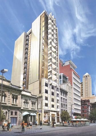
The design has been ammended. It appears that the council won the arguement and the curved element has been removed. However it is not all bad news, as the new design is quite attractive nonetheless:

-
Will
- VIP Member

- Posts: 5864
- Joined: Fri Sep 16, 2005 6:48 pm
- Location: Adelaide
#112
Post
by Will » Wed Dec 10, 2008 5:37 pm
More information:
The building is designated as student accomodation, and it will contain 150 rooms (yes rooms not apartments!) ranging in size from 16.4m2 to 29.2m2. However in fairness whilst these apartments appear incredibly small, they are designed to be occupied by just 1 student each.
The building will have a rooftop recreation area as well as a mezzanine common area.
It will have a ground floor retail tenancy as well as a small basement carpark.
The building which has a frontage of 11.15m to North Terrace will be built using bronze tones and its plinth will be composed of masonry so as to blend in with the many neighbouring heritage buildings.
-
AtD
- VIP Member

- Posts: 4579
- Joined: Wed Jul 20, 2005 7:00 pm
- Location: Sydney
#113
Post
by AtD » Wed Dec 10, 2008 5:47 pm
Thanks Will. Interesting how they've required a continuation of the level of the building to the west by having a heavier facade at the lower levels and the removal of the balconies. It looks as if the section at the bottom of the eastern face is concrete/stone.
I don't think the continuation of the height of the neighbouring building was really necessary considering no other building on the strip matches it. I prefer either of the original designs we saw, to be honest. The "straight" proposal had very strong vertical lines that continue all the way to the ground, which add character IMO. It looks the ACC have removed these on both the northern and eastern face, taking this character with it. The "curved" facade was simply unique for Adelaide and would have been a refreshing change from the monotony of boxes that has been imposed on parts of the skyline.
Admittedly we're comparing high quality renders a less 'photo-real' one, but over all, I wish the ACC kept their nose out of it!
-
Matt
- Legendary Member!
- Posts: 1125
- Joined: Wed Feb 07, 2007 12:36 pm
- Location: London
#114
Post
by Matt » Wed Dec 10, 2008 5:55 pm
A choice of two modern, attractive, eye-catching designs, and shock horror - neither are good enough, and instead - any unique features are removed to leave yet another building to blend into the background.
Bravo.
God, this city frustrates the fuck out of me at times.
-
aussie2000
- High Rise Poster!
- Posts: 225
- Joined: Sat Oct 15, 2005 1:12 pm
- Location: Adelaide, Australia
-
Contact:
#115
Post
by aussie2000 » Wed Dec 10, 2008 7:20 pm
well i think its a great looking building and will look great on North Terrace, i actually preferred the gold like render over the white curved one, the gold like one looks more classy, perfect for adelaide, although i would have been happy with both
-
frank1
- Donating Member

- Posts: 439
- Joined: Mon Oct 08, 2007 4:54 pm
#116
Post
by frank1 » Wed Dec 10, 2008 7:43 pm
aussie2000 wrote:well i think its a great looking building and will look great on North Terrace, i actually preferred the gold like render over the white curved one, the gold like one looks more classy, perfect for adelaide, although i would have been happy with both
Agreed. I never really liked the curved proposal anyway, it looked kinda cheap.
-
Düsseldorfer
- High Rise Poster!
- Posts: 288
- Joined: Sat Sep 15, 2007 3:52 am
#117
Post
by Düsseldorfer » Wed Dec 10, 2008 9:13 pm
This is another piece of sad news for the city, such a beautiful building was proposed with the curved front, something that was different and would have stood out from the crowd, instead we get what looks like a copy of that really skinny one to the west of the old John Martins Carpark apartment building combined with elements of the one across from the railway station

maybe architects here should just give up and stop proposing cool designs, and take a moment and think; "wait, this is Adelaide, make it as boring as possible..cause the government here wont allow a cool looking building, and i should save them for Melbourne and Sydney"
but we should be lucky we're getting a building at all with all this global financial crap going on
-
Just build it
- High Rise Poster!
- Posts: 233
- Joined: Thu Feb 21, 2008 6:12 pm
#118
Post
by Just build it » Wed Dec 10, 2008 10:18 pm
Have to admit it's a very clever re-design by the architects to ensure approval IMO. The cardigans at ACC planning would have been jumping for joy. There's no way I can blame the architects for this result because they gave us interesting and it was shot down. Can't afford to miss the mark again so they've gone ultra-conserative. Considering this I don't mind the use of stone for the lower facade to blend in with it's neighbours and I like the use of bronze for it's feature colour but god forbid, is that eastern elevation really now 80% sandstone coloured blank wall? If so I imagine that side looking awful in reality and there's no hope of it ever being concealed by further development.
Overall it's sure to blend in perfectly with the collection of sleepy large buildings we already have and TBH it does now look very 'Adelaide'.
-
YokohamaBoy
- Sen-Rookie-Sational
- Posts: 25
- Joined: Sun Sep 23, 2007 3:08 pm
- Location: Kawasaki
#119
Post
by YokohamaBoy » Wed Dec 10, 2008 11:16 pm
looks like they've redesigned it to look like it was built in the 70s.... great

-
SRW
- Donating Member

- Posts: 3658
- Joined: Fri Jun 08, 2007 9:42 pm
- Location: Glenelg
#120
Post
by SRW » Wed Dec 10, 2008 11:39 pm
The redesigned north-facing façade is not disappointing at all, but that eastern façade is abhorrent. Where'd the glass go? What a terrible way to waste a view, especially when it borders a heritage property and is there for the taking!
Keep Adelaide Weird
Who is online
Users browsing this forum: abc, Ahrefs [Bot], Majestic-12 [Bot] and 7 guests


