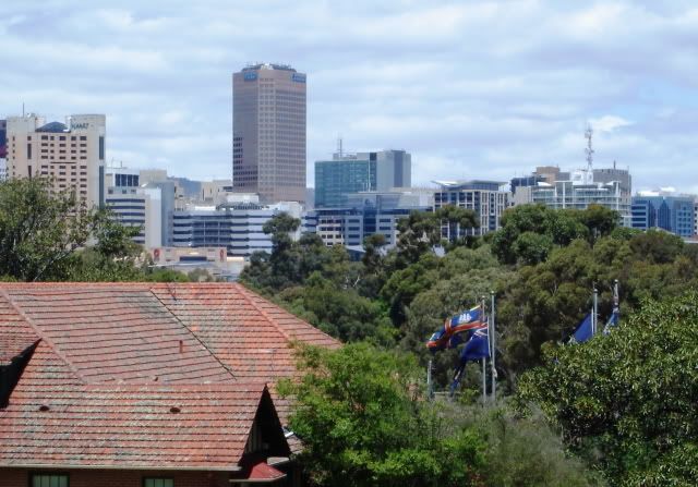
[COM] ANZ Tower | 84/99m | 22lvls | Office
[COM]
There's an article in this weeks Adelaide Review regarding CC1 and the spire. Apparently the spire was modelled after the GPO clock, taking the same proportions of it and being careful not to overpower the GPO clock. When it is lit up eventually, it will be seen as two spires in harmony from victoria square.
[COM]
A development application has been lodged for the erection of 3 roof level, 1 wall mounted and a ground level illuminated signs for the building. This was lodged on November 14, and is expected to cost $250 000.
[COM]
Although I do like CC1 especially from Victoria Square and the east, the western perspective is wrecked by the core wall. Landmark buildings of around 20 storeys in Adelaide should not be able to have such a dominant wall taking up one whole side of the building. Too many blank/bland walls from the western end of town. Also how long does it take to get a couple of panes of glass on the southern side to fix up the gaps and broken pieces been months now. Obviously focusing on internals for a February opening.


[COM]
I cannot understand why the building has such a huge ugly western façade. I could understand if the building was sitting next to land primed for development, but in this case the huge grey wall abbuts next to the new Advertiser Building. The new Advertiser building will last at least 50 years, so why didn't the ACC force the developers to cover the western facade in something interesting. That huge grey wall ruins the building for me.
- Ho Really
- Super Size Scraper Poster!
- Posts: 2715
- Joined: Sun Aug 27, 2006 3:29 pm
- Location: In your head
[COM]
I agree. Could it be that the developers wanted large open floors without a central core? Still, they should have covered those cement walls with decorative panels.Will wrote:I cannot understand why the building has such a huge ugly western façade. [...] That huge grey wall ruins the building for me.
Cheers
[COM]
Spire will take some of the attention away from the wall once completed. Plus, it's not that bad. It actually looks pretty good at night, with the thin lwindows lit up.
[COM]
This may have something to do with the afternoon sun from the west.UrbanSG wrote:..... Too many blank/bland walls from the western end of town.....
Too much glass = bloody hot office.
But funny this should come up. I was walking through Rundle Mall on Saturday and looking at the Renaissance building and thought that needed something a bit more exciting on the western wall. Have a look next time, it looks crap!
-
.::G!oRgOs::.
- Gold-Member ;)
- Posts: 83
- Joined: Wed Jul 20, 2005 12:01 am
- Location: City of Unley
[COM]
upon closer inspection, the glass which has been replaced does not seem to be the same type of glass as the rest of the building. it looks quite awkward and a bit dodgy, has anyone else noticed?
-
.::G!oRgOs::.
- Gold-Member ;)
- Posts: 83
- Joined: Wed Jul 20, 2005 12:01 am
- Location: City of Unley
[COM]
Because at the moment it looks like it is unfinished to me.Ho Really wrote:No. Why would you want glass all the way up?.::G!oRgOs::. wrote:Is glass going all the way up the spire? Because at the moment I hate it.
Cheers
Who is online
Users browsing this forum: Ahrefs [Bot] and 6 guests


