Page 17 of 19
[COM] Re: #COM: Spark 88 Apartments | 47m | 15lvls | Student
Posted: Thu Dec 04, 2008 11:49 am
by omada
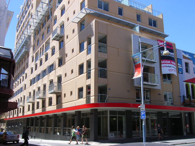
An absolute shocker! Even worse than Coglin Street, how this one got approved we will never know, it really adds to Adelaide's crappy architectural landscape.
[COM] Re: #COM: Spark 88 Apartments | 47m | 15lvls | Student
Posted: Thu Dec 04, 2008 2:57 pm
by ghs
I just had a look at the rental prices. $300 a week for a single room.
Would you pay that much for a shoebox on hindley street ?
[COM] Re: #COM: Spark 88 Apartments | 47m | 15lvls | Student
Posted: Thu Dec 04, 2008 3:00 pm
by Ben
ghs wrote:I just had a look at the rental prices. $300 a week for a single room.
Would you pay that much for a shoebox on hindley street ?
Wow I pay that much for a new 3 bedroom townhouse in Mile End 2 mins from town. I know what i'd prefer for the price.
[COM] Re: #COM: Spark 88 Apartments | 47m | 15lvls | Student
Posted: Thu Dec 04, 2008 3:13 pm
by ghs
I reckon IPAD is a better option. It's cheaper and in a better location.
[COM] Re: #COM: Spark 88 Apartments | 47m | 15lvls | Student
Posted: Thu Dec 04, 2008 10:22 pm
by jk1237
I really dont have a problem with this development. Considering what was there before, and considering the stuff built in the 1970s and 80s in Adelaide, I dont mind spark. Id rather some density and this, to nothing at all. If everything built from now on was the similar blue or green glass structure effect, that would start to get boring also. I must admit Ipad does have a better choice of colours for its facade.
I think square boxes suit Adelaide. Brisbane, for example, can have its curved reflective glass buildings all to itself
[COM] Re: #COM: Spark 88 Apartments | 47m | 15lvls | Student
Posted: Thu Dec 04, 2008 10:58 pm
by Snorkie
jk1237 wrote:I really dont have a problem with this development. Considering what was there before, and considering the stuff built in the 1970s and 80s in Adelaide, I dont mind spark. Id rather some density and this, to nothing at all. If everything built from now on was the similar blue or green glass structure effect, that would start to get boring also. I must admit Ipad does have a better choice of colours for its facade.
I think square boxes suit Adelaide. Brisbane, for example, can have its curved reflective glass buildings all to itself
Yep totally agree with you. Its no masterpiece but it will do. Most of the photos on here are of the southern facade, which you really cant see from anywhere anyway, unless you are standing on the opposite side of Hindley. For some reason I actually dont mind the western facade. The amount of times I been in light square and looked at this, and thought it dont look half bad from a distance. Lets face it this building is hardly visible from any angle, so as a density filler Its ok compared to the even worse crap around it.
[COM] Re: #COM: Spark 88 Apartments | 47m | 15lvls | Student
Posted: Sun Dec 07, 2008 6:41 pm
by jk1237
[COM] Re: #COM: Spark 88 Apartments | 47m | 15lvls | Student
Posted: Sun Dec 07, 2008 6:46 pm
by Shuz
Just out of curiousity - knowing that all residential buildings are obviously strata-titled, nevertheless, is it possible for the external structure to be modified at a later time - eg: Reclad, painted, louvres installed, etc?
[COM] Re: #COM: Spark 88 Apartments | 47m | 15lvls | Student
Posted: Sun Dec 07, 2008 6:59 pm
by AtD
Yes. It's the role of the body corporate to organise such things and have the owners pay their share.
[COM] Re: #COM: Spark 88 Apartments | 47m | 15lvls | Student
Posted: Mon Dec 08, 2008 4:14 am
by Pistol
AtD wrote:Yes. It's the role of the body corporate to organise such things and have the owners pay their share.
Hence it would never happen
I'm just happy it didn't turn out as orange as in the original renders.
Of course we want our overseas students to feel like they are in Yatala
[COM] Re: #COM: Spark 88 Apartments | 47m | 15lvls | Student
Posted: Mon Dec 08, 2008 11:07 am
by Pants
Sweet jesus that's awful.
I see no redeeming qualities in it whatsover - not even adding bulk to that area of town.
Commerce aside, I seriously would have preferred a park - it's that bad.
[COM] Re: #COM: Spark 88 Apartments | 47m | 15lvls | Student
Posted: Sun Dec 21, 2008 12:41 am
by arki

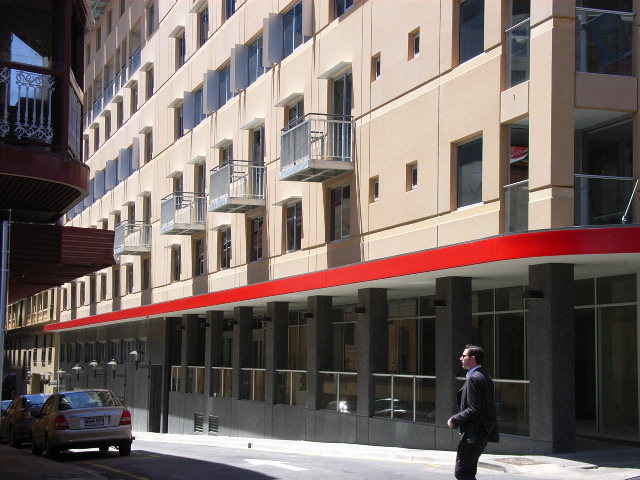
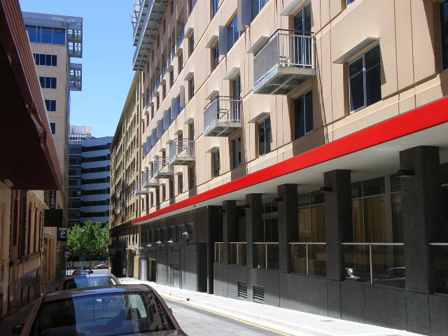
Aside from the horrid balconies and the out of place red stripe, I think this pic looks good and it actually fits in with the rest of this little side street's streetscape. (I am hoping that is going to be a cafe or restaurant on the right....)
[COM] Re: #COM: Spark 88 Apartments | 47m | 15lvls | Student
Posted: Sun Dec 21, 2008 11:14 am
by Shuz
I agree Arki, you'd think that would be in Europe somewhere. But it still doesn't detract from the fact that its still a pretty ugly building.
And having just said that, and thinking about the Majestic Hotel development down the road - when built, what'll the visitors think of us! Seeing this horrendous building from their hotel rooms. Tskche.
[COM] Re: #COM: Spark 88 Apartments | 47m | 15lvls | Student
Posted: Sun Dec 21, 2008 3:42 pm
by Prince George
The Queen and I were just saying this morning that we don't understand why this particular building is attracting so much negative opinion. As I've said elsewhere, it seems to me that it's a victim of a pro-glass anti-concrete attitude. I for one am glad to see a break in the continuous parade of glass rectangles that we're getting, and it doesn't even have the number one red flag for this site - the dreaded Blank Western Facade.
Instead there's a variety of window sizes and treatments, a variety of placements for the overhanging balconies, and the areas formed by the setbacks look like promising areas for the mixed public/private feeling that I like about mixed-use areas. To my mind it seems more interesting than, say, Conservatory on Hindmarsh with its rather more uniform appearance that keeps the occupants out of public view.
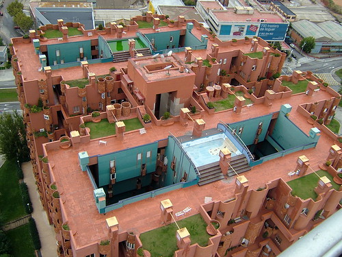
Let me try throwing a comparison out there, take a look at this housing project from Spain:

Now, I'm not trying to say that Spark is particularly like this one, but my first impression of seeing this project was that, apart from some varying shape, it seemed rather blank with large amounts of bare wall. The round balcony/window pieces were rather plain looking and seemed to be scattered in no particular pattern and there are large patches of flat concrete. Overall, it seemed rather monotonous
In fact, the building has an extraordinary interior that mixes the inside and outside. It turns out that the perspective of the first images I saw of it were possibly its worst angle, even just turning to the side exposed just how open this building really is. I think that my first reaction was negative because of those bare concrete areas, and I wonder if that isn't the same thing that's happening here (at Spark). I wonder if it's just that we've developed some sort of allergy to concrete and dismiss it too quickly. And, on the other hand, accept any other finish (ie glass) too readily, even when it's used in less interesting manners.


BTW, this is "Walden-7" in Barcelona, designed by Ricardo Bofill, built on the site of an old cement works and "with a budget substantially lower than those usually assigned at the time to public housing".
[COM] Re: #COM: Spark 88 Apartments | 47m | 15lvls | Student
Posted: Sun Dec 21, 2008 6:29 pm
by monotonehell
Prince George wrote:The Queen and I were just saying this morning that we don't understand why this particular building is attracting so much negative opinion. As I've said elsewhere, it seems to me that it's a victim of a pro-glass anti-concrete attitude. I for one am glad to see a break in the continuous parade of glass rectangles that we're getting, and it doesn't even have the number one red flag for this site - the dreaded Blank Western Facade.
Instead there's a variety of window sizes and treatments, a variety of placements for the overhanging balconies, and the areas formed by the setbacks look like promising areas for the mixed public/private feeling that I like about mixed-use areas. To my mind it seems more interesting than, say, Conservatory on Hindmarsh with its rather more uniform appearance that keeps the occupants out of public view...
The problem is that they've taken a uninteresting, shear, bulky box and then tried to dress it with treatments that all look like afterthoughts. The frame on the Hindley-facing centre windows just looks like it's tacked on. The hung catwalk-like metal shelves around some of the building look like something an air-conditioning installer would tack onto an old building in order to sit heat exchangers on. The actual balconies also look like afterthoughts.
Result; an aesthetic that lacks any kind of harmony between the contrasts of monolith to wire frame. Ugly tacked on to ugly.
Edit: oh and the attempt at contrast through size (the windows) is also fail, because they've used repetition that kills contrast. You can only achieve contrast via size if you interrupt repetition. The different sized windows are all in a column on one side of the building, and I'd say they are more a utilitarian result of the placement of bathrooms or stairways than an attempt at aesthetics.
