Page 21 of 53
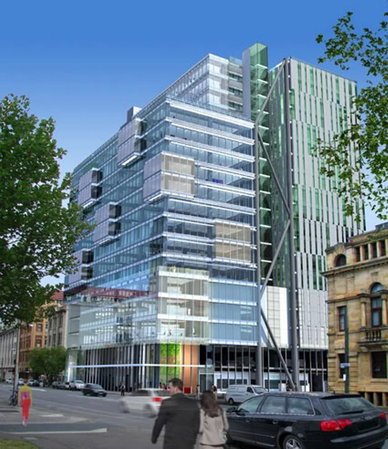
[COM] Re: #APP: Tower 8 | 72m | 20lvls | Office [City Central]
Posted: Wed Jan 07, 2009 5:21 pm
by frank1
That looks alot better. I actually like it now and hope it gets built.

[COM] Re: #APP: Tower 8 | 72m | 20lvls | Office [City Central]
Posted: Wed Jan 07, 2009 5:56 pm
by skyliner
Much improved - 20 levels as well. the only thing I don't like are the pods - kind of like a dating flavour -of -the -month architectural feature of these times. Much rather see a cantilever awning - especially if retailing is going to be a function of the ground level. Would tie it bac k to the CBD proper then for pedestrian access in the fickle Adelaide weather patterns.
ADELAIDE - TOWARDS A GREATER CITY SKYLINE
[COM] Re: #APP: Tower 8 | 72m | 20lvls | Office [City Central]
Posted: Wed Jan 07, 2009 5:57 pm
by Shuz
Shall I take dibs at the naming of the City Central Plaza to the "Vomitarium"?
[COM] Re: #APP: Tower 8 | 72m | 20lvls | Office [City Central]
Posted: Wed Jan 07, 2009 7:36 pm
by UrbanSG
Further to Will's post the quote below is also on the Woods Bagot website.
The articulated thermal panels and patterned screen facades sound interesting, they may be those new sections that appear as shade devices in that new render. It sounds like they may be used on the western elevation too. I really hope they have changed the western elevation substanitally but I won't hold my breath.
These changes may be in response to a tenant showing interest, one can only hope.
City Central Tower 8
Tower 8 is the third office building of the evolving City Central Precinct in Adelaide's central business district. It is designed to achieve 5 Star Green Star and 5 Star NABERS.
Tower 8 incorporates:
landscaped roof at level 13 - feature expossed 17 level stair
patterned screen facades to east and west
southern ‘pod’ spaces to the South
double height public foyer incorporating retail spaces
passive chilled beams to all NLA
highly articulated podium that activly engages with it’s heritage context
full height, floor to ceiling, low energy, glare and reflectivity double glazed vision panels to North, east and south facades
articulated thermal panels incorporated in high rise east and west facades to reduce building heat loads
sun shading to north facade
Here is the render again from the Woods Bagot website thanks to Will (from this inital render I am finding this building far more interesting, still boxy but more detailed than CC1/CC2):

[COM] Re: #APP: Tower 8 | 72m | 20lvls | Office [City Central]
Posted: Wed Jan 07, 2009 8:16 pm
by Plasmatron
Definitely improved to some degree (apart from failing to eliminate the notion of "pods" from existence), which I guess wasn't too hard to achieve, but now they just need to give the height a good ol' fashioned doubling, so it actually looks more tower-like instead of cube-ish. Especially on such a prominent location.
Tell him he's dreaming, eh?
[COM] Re: #APP: Tower 8 | 72m | 20lvls | Office [City Central]
Posted: Wed Jan 07, 2009 10:12 pm
by SRW
Hodgepodge.
Start again, fresh.
[COM] Re: #APP: Tower 8 | 72m | 20lvls | Office [City Central]
Posted: Wed Jan 07, 2009 11:51 pm
by Omicron
Good god, it's a Rubik's cube.
[COM] Re: #APP: Tower 8 | 72m | 20lvls | Office [City Central]
Posted: Thu Jan 08, 2009 1:39 am
by davideoeo
Hideous – it may be just as well there is a global downturn; this type of architecture is going to age terribly.
[COM] Re: #APP: Tower 8 | 72m | 20lvls | Office [City Central]
Posted: Thu Jan 08, 2009 10:47 am
by omada
Build it I say!
Why you say? Why aren't I whinging like everyone else on this forum, expecting Adelaide to be the new Dubai, or some European city?
1. It is aiming for a 5 star green rating.
2. A relatively minimalist glass structure, I don't think it will age that badly at all!
3. This is one that may actually get built! I have said it before and I'll say it again - beggars cannot be choosers people.
[COM] Re: #APP: Tower 8 | 72m | 20lvls | Office [City Central]
Posted: Thu Jan 08, 2009 10:58 am
by UrbanSG
I agree, build it. I have decided I rather like this design compared to the old one. It is still hard to tell for sure though without seeing the western elevation changes as yet.
A lot of the design in this one now reminds me of development going up interstate, particularly Melbourne and also overseas, especially that new eastern elevation treatment.
Adelaide is far too conservative, some of the comments re this and SA Water prove that.
We are not going to get the height so get over it! Expect developers to maximise their land holdings with boxy developments too, particularly in the current economic climate.
This part of Franklin Street is in desperate need of a development like this.
[COM] Re: #APP: Tower 8 | 72m | 20lvls | Office [City Central]
Posted: Thu Jan 08, 2009 11:26 am
by Professor
Looks a lot better and has a real chance of starting construction.
Build it ASAP to fill in the ugly ground space there at the moment
[COM] Re: #APP: Tower 8 | 72m | 20lvls | Office [City Central]
Posted: Thu Jan 08, 2009 11:35 am
by Shuz
-facepalms-
[COM] Re: #APP: Tower 8 | 72m | 20lvls | Office [City Central]
Posted: Thu Jan 08, 2009 3:17 pm
by JamesXander
I like it
I love how Adelaide has so many different buildings, this is just another example of that.
I am beginning to agree with people about streetscapes.
I drove down Flinders Street (not 100% if it was) and that place is the worst. Its just a street of glass. Shops and cafes make a street come alive, a city come alive.
[COM] Re: #APP: Tower 8 | 72m | 20lvls | Office [City Central]
Posted: Fri Jan 09, 2009 2:00 pm
by Pants
It's better and more interesting, but it still looks like they've tacked on a few ideas they learnt from Architecture 101 to make buildings a bit different, without them merging well together.
It would be much better without the pods, which despite giving continuity with CC2, still (for want of a better word) suck.
[COM] Re: #APP: Tower 8 | 72m | 20lvls | Office [City Central]
Posted: Thu Jan 15, 2009 9:56 pm
by Will
The proposed changes to the façade of this building, featured in the photo that I found on the real-estate website will come before the ACC DAP next Monday.
The ACC is expected to grant planning APPROVAL to these changes.
The zig-zag metallic thing on the eastern façade is actually the building's earthquake bracing. The changes also include the already observed external changes to the east and west façades. Both façades will be designed to be 50% glass and 50% solid so as to balance energy efficiency with views. Further changes include a slight alteration to the location of the pods on the southern façade in response to tenant requirements. Such changes appear to have been influenced by the requirements of a tenant. As such a tenant may have already been found.

