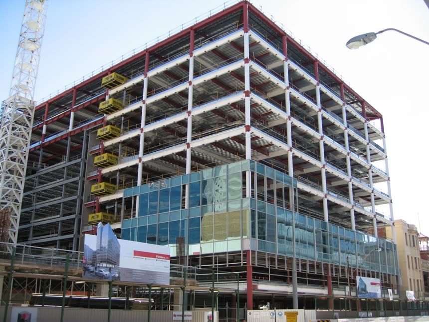
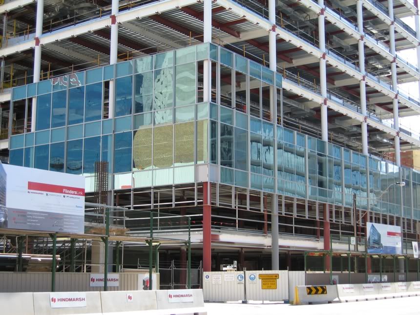
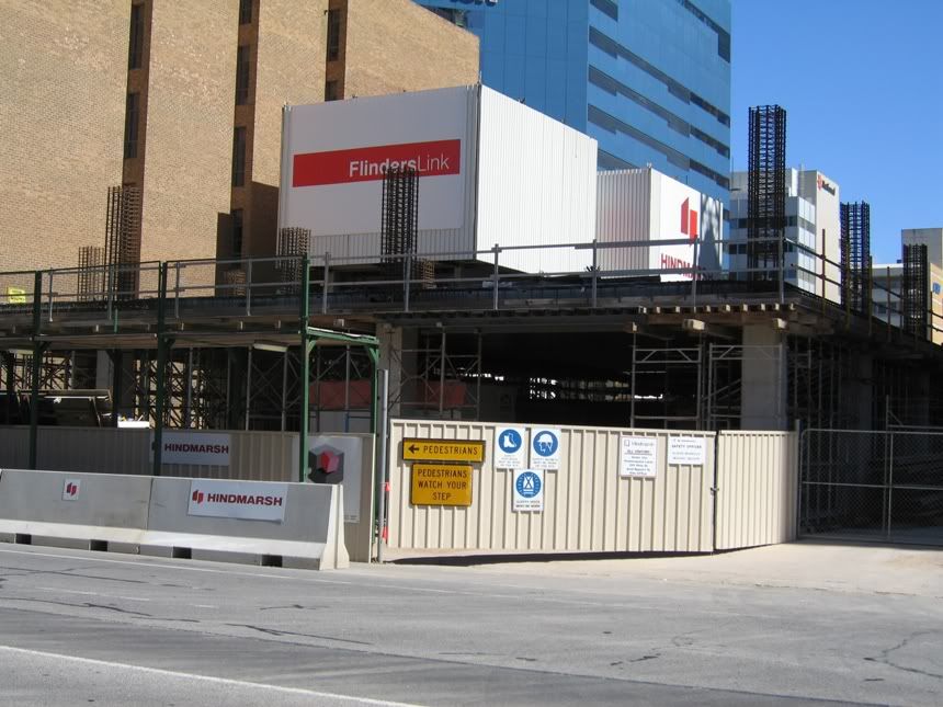
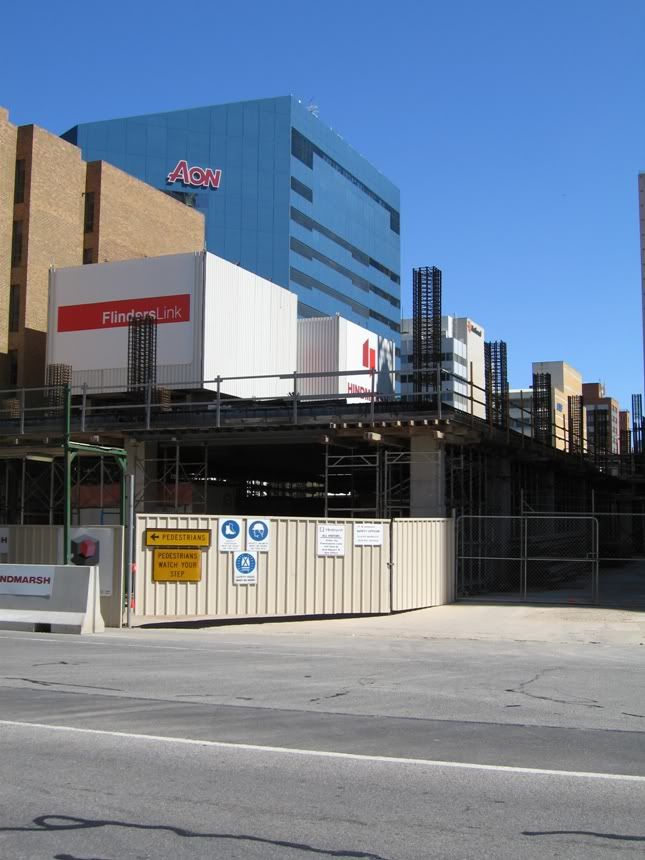
I couldn't be tittyfarked taking pics of 'em. When Pantaloons get's back to work, I'm sure he'll take some when he strolls past.
[COM] Flinders Link | 54/42m | 15/9lvls | Office
[COM]
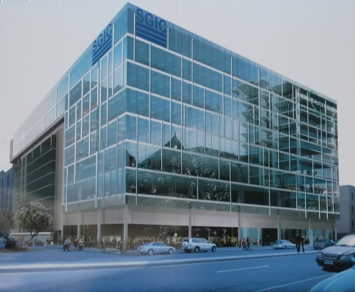
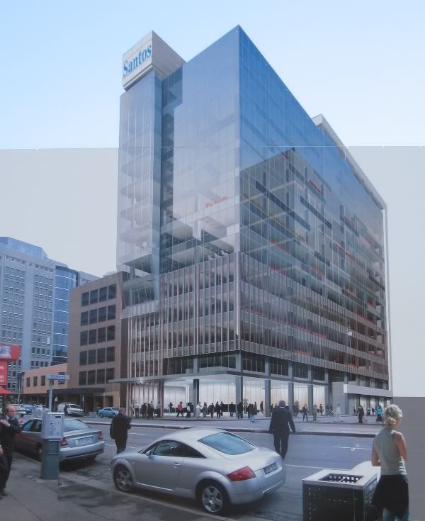
Renders for both towers are on site now, Santos definately looking most Funk-ayy.
I couldn't be tittyfarked taking pics of 'em. When Pantaloons get's back to work, I'm sure he'll take some when he strolls past.
I couldn't be tittyfarked taking pics of 'em. When Pantaloons get's back to work, I'm sure he'll take some when he strolls past.
[COM]
Hassell designed both buildings. Obviously they had different budgets, but why the f@#& couldn't they give the IAG building a better entrance?
It is one of the most uninviting square boxes I've seen. Where do you enter from? What distinguishes the entrance?
The first renders were infinently better, as is the Santos building.
It is one of the most uninviting square boxes I've seen. Where do you enter from? What distinguishes the entrance?
The first renders were infinently better, as is the Santos building.
[COM]
Awesome shirt!
My thingy has a pretty low contrast monitor, so is that colour thingies I see littered around the facade of the Santos building? Or is it something coming through from the other side of the paper, or am I just suffering from Christmas-itis?
I've hated the IAG (SGIC?) building all this time, but the Santos building could do a lot to cover up the big fat bulkiness that I hate about it, in which case..... might not turn out so bad after all
[COM]
thanks for the renders pants
I must say I'm a bit disappointed by the latest Santos render. I thought the first render we saw was v cool with those horizontal glass projections coming off the facade (for want of a better description) but to me this design seems to have been dumbed down a lot... but gotta look on the bright side, its still damn nice tower and should do the skyline proud. *edit* I guess the other thing is that a lot of that fancy glasswork would be hidden by the IAG building anyway so arguably it would be a waste of effort... *end edit*
Having said this maybe these renders are already out of date - the banding which seems to be going on the IAG building (now SGIC?) doesnt show up in this render for whatever reason??
[COM]
Adelaide City Council did not want the glass overhangs on Santos due to public space issues etc so that's why they have been taken out apart from a compromise one at the front of the building. What is with the verticle line features on the first 4 floors above ground level? Not sure I like that addition either. Have to wait until it's up I suppose. To me though it looks ugly and dates the building. I preferred basic glass all the way to the bottom. The building is definately 13 floors too not the 15 some were suggesting.
[COM]
I really like the vertical line features. It appears to be a small attempt at balancing the street frontage with the neighbouring building, and does it quite effectively IMO. I think you'll be pleasantly surprised when you see it in person.
As for IAG, let's hope the "build highly reflective facade, hope something spectacular is built across the street" approach works
As for IAG, let's hope the "build highly reflective facade, hope something spectacular is built across the street" approach works
[COM]
I think you'll find it's 13 floors of the larger floorplate, with another two smaller floors set further back - as per the top 2 floor setback on Admiral House.UrbanSG wrote: The building is definately 13 floors too not the 15 some were suggesting.
I've seen at least 4 DAs on the ACC site which indicate the tower is 15 levels. If they have counted the ground floor as one - who knows.
Meh, who cares.
- Thunderstruck
- High Rise Poster!
- Posts: 127
- Joined: Fri Jul 29, 2005 9:41 am
- Location: Seaford Meadows, SA
[COM]
I still think the Santos render looks pretty sexy. Love the dark colour, I have a think for dark blue/black glass and looks swish enough.
IAG a bit less inspiring and totally agree re entrance. As if building is just sitting there with no invite saying "Look at me come inside".
IAG a bit less inspiring and totally agree re entrance. As if building is just sitting there with no invite saying "Look at me come inside".
"He was the sort of person who stood on mountaintops during thunderstorms in wet copper armour shouting "All the Gods are bastards" - Pratchett
[COM]
There was an article late last year stating that the naming rights are up for grabs on the old santos - it will go to the main tenants... ideally it should go to a company which has a need for such exposure (such as holden, microsoft).
[COM]
Thanks Pants for the images!
Although it is rather bland, the fact that the IAG building is fully enclosed in glass will ensure it adds a modern touch to the Adelaide skyline which currently has an over-supply of concrete.
I really like the Santos tower, it has a nice design; however I am annoyed why the initial renders of a tower always look better than the finished project.
Who is online
Users browsing this forum: No registered users and 3 guests

